

Ranking every country in the world
A report card on how the world is doing right now.


I’ve been struggling to follow the news in any way that is productive. It’s too zoomed in on the most dramatic things happening today, without any context of the wider picture and what the trends are actually saying about our countries and the world.
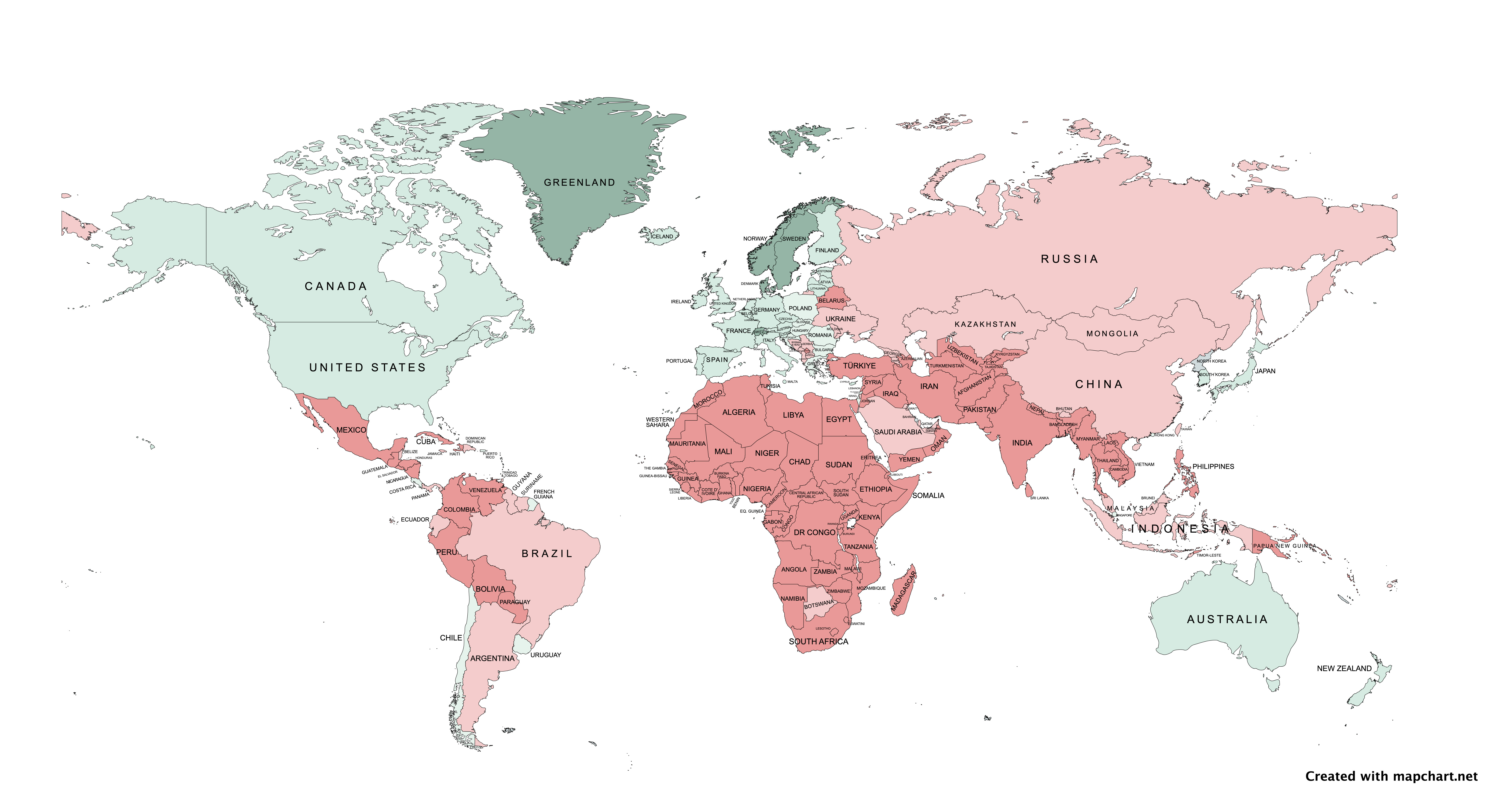
So I decided to zoom out and make a report card for the whole world. Something that is a snapshot of how every country is doing in terms of governance and economics, and whether they are trending in a positive or negative direction compared with 10 years ago.
Click the button below to access the complete report card, then scroll down for a detailed description of how I tabulated each country’s score.
A few takeaways:
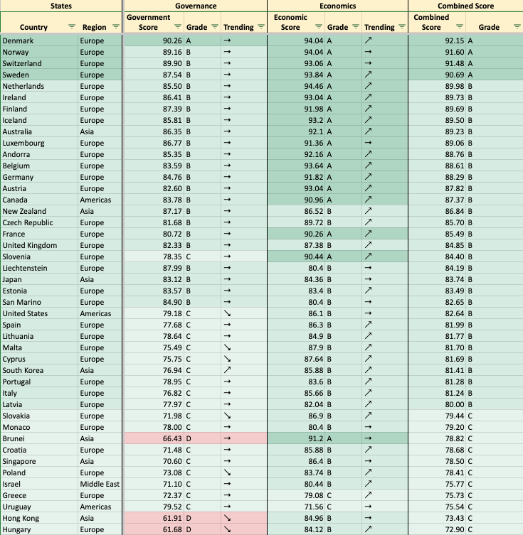
Good countries are good across the board. The top countries are the top countries everywhere; the bottom countries are the bottom countries everywhere. If you take any one of the metrics in my spreadsheet and rank the sheet by that metric alone, you continually see the same set of countries in the A and B categories, and the same countries in the D and F categories. Variances are slight, and the more drastic ones happen in the middle (C category). The top 25 countries in terms of governance (A and B rated) are holding steady without sign of decline. The middle countries (C and D rated) swing more drastically up or down, and down is currently more common.
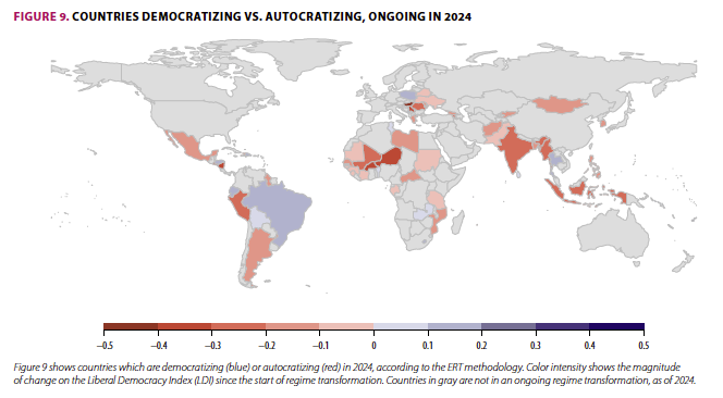
Autocracy is on the rise. Countries across the board are seeing lower governance scores compared with 10 years ago, and, as a result, many have fallen below the “autocracy” threshold. Only 19 countries and less than 6% of the world’s population have shifted into democracy, largely Brazil, Poland, and Thailand. Meanwhile, 45 countries and 38% of the world’s population have shifted into autocracy—largely Asia, but also Mexico, and many Middle Eastern and African countries. Here are the countries that have shifted the most in a democratic direction (blue) and autocratic direction (red):
Democracy and human rights are on the decline. Freedom of expression is the democratic value that took the biggest hit (according to V-DEM, it’s deteriorating in 25% of the world’s countries), and electoral integrity is on the decline in 25 countries, with worldwide increases in registration fraud, intimidation, vote-buying, and electoral violence. According to Freedom House, in 2024, over half of worldwide elections experienced manipulation and 40% resulted in violence, including assassination attempts, attacks on polling places, and protests quelled with extreme violence. Rule of law is also corroding, with politicians pressuring judges and prosecutors in 78 countries over the last decade.
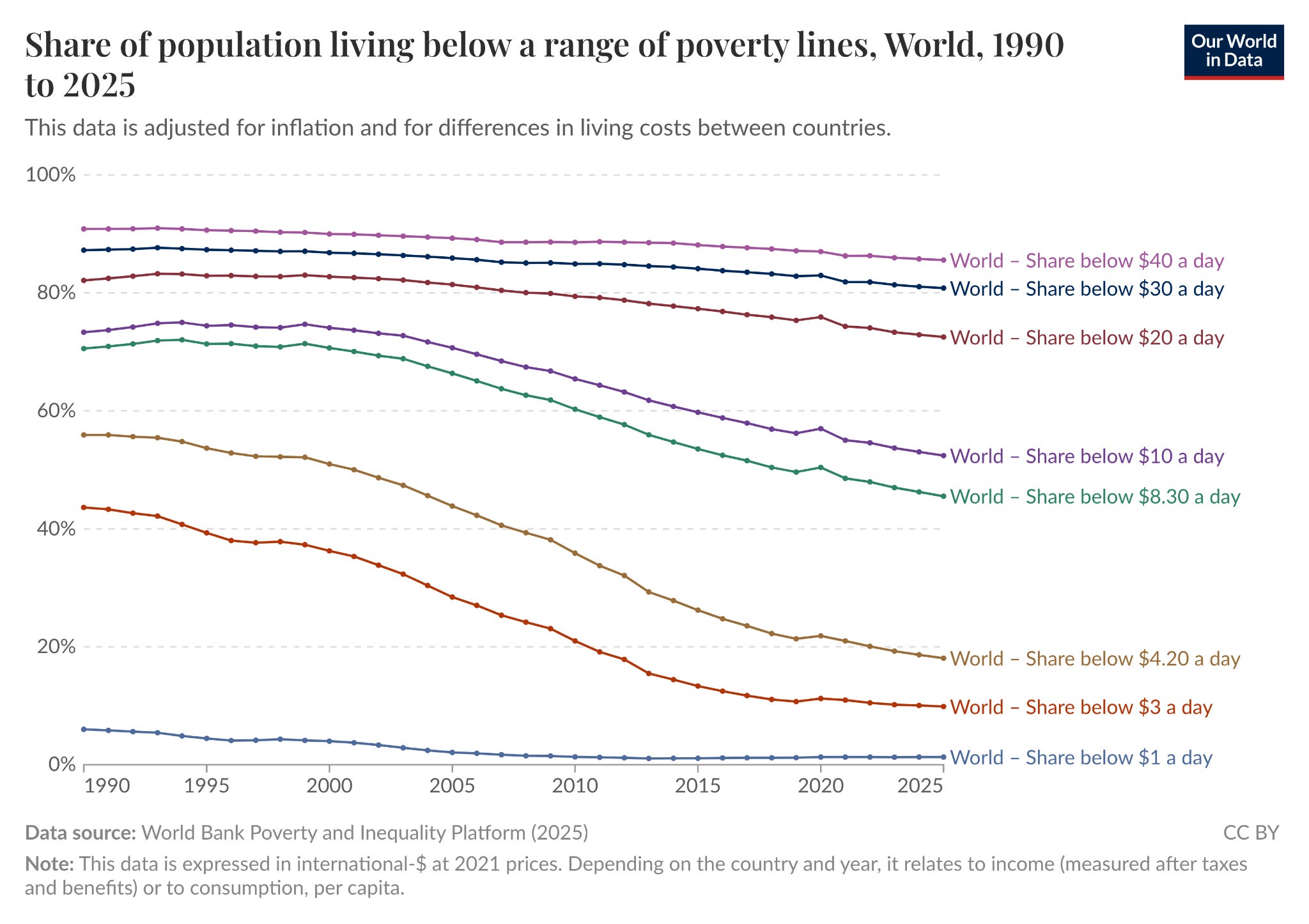
Economies are doing very well and have made a lot of progress compared with 10 years ago. In good and bad governments alike, economies are currently soaring, which is benefitting people around the world and eradicating poverty at nearly every level.
There is a strong correlation between good governance and good economies. In general, if countries have good governance, they also have a good economy. That’s a little less true in the inverse: Countries can have a rich and even equitable economy without having a good government. Brunei, for instance, is an interesting outlier—it is so oil-rich that it is one of the wealthiest and even most equitable countries, and thus scores highly on economics, even as it is ruled by a sultan with an absolute monarchy and censored media, and thus scores poorly on governance.
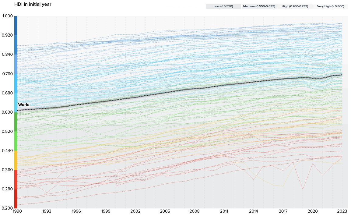
Human development is on the rise. Despite the fact that governments are doing worse, scientific programs and human advancements are doing better, as evidenced by the fact that nearly every country on the UN’s Human Development Index has been on an upward slope since 1990. Life expectancy is on the rise, more people are being educated than ever before, and more people are earning a good living.
How I determined the governance score
To rank every country’s governance, I pulled from four authoritative sources:
Freedom House and V-DEM (35% of the total score). These organizations score countries on democracy, rights, and human freedoms. Freedom House tracks 25 metrics relevant to political rights and civil liberties, but not in a very granular way—if countries have elections, they tick that checkbox. V-DEM tracks six metrics but goes deep on them—is decline caused by courts, media, elections, or civil society? I averaged these two indices together, but gave 60% of the weight to V-DEM as it’s the more granular and authoritative source.
The World Bank’s Worldwide Governance Indicators (35% of the total score). The WGI scores countries on six metrics relevant to governance quality: Political stability and the absence or presence of violence and terrorism, government effectiveness and the quality of public services, regulatory quality and private sector development, confidence in rule of law, control over corruption, and accountability by the population. I averaged all six scores together to come to one total score.
The UN’s Human Development Index (30% of the total score). The HDI scores countries on their human welfare as measured by life expectancy, years of education, and gross national income per capita.
Alone, any one of these scores provide an incomplete picture. Singapore, for example, scores very low on democracy (because it isn’t one), but it scores very high on governance quality and standard of living (because it’s a very good place to live). Bhutan, for another, scores highly on governance quality (because they have a very stable government with low crime), but it scores low on human welfare (because the country is still catching up on education and income). By combining all four reports, we can see a more complete picture of how countries are performing.
I weighed democracy (V-DEM and Freedom House) at 35% of the governance score, governance quality (the World Bank’s Worldwide Governance Indicators) at 35%, and human welfare (the UN’s Human Development Index) at 30%. I normalized numbers for each score so that they all wind up on a scale between 1 and 100, which allowed me to give every country a grade depending on its total score. (A, B, C, D, or F).
Now that I had a baseline understanding of how all of our countries are doing, I wanted to understand how things are trending. Are the various countries on this list trending in a good direction? Or a bad one? To figure this out, I went back to all of those sources and added numbers from 10 years ago. Most countries fluctuate up or down by 3 points depending on minor reforms or setbacks, but they can swing by up to 5 points in the case of major reforms or setbacks, or can even gain or lose 10 points in the case of a complete overhaul or collapse. Based on this understanding, if countries were trending up or down by 3 points or less compared to 10 years ago, I used a lateral arrow to indicate that they are holding steady. If countries were trending up or down by more than 3 points, they got an up or down arrow.
How I determined the economic score
To determine the health of economies around the world, I relied on the world’s most reliable metrics:
Gross National Income, PPP (60% of the total score). GNI is the income per year, per person in each country, and it’s an effective way to track how citizens are doing in each country. Purchasing power parity (or PPP) means the total is put in “international dollars” and takes into consideration how much you can purchase with a dollar in each place. In other words, $1 buys you the same amount of goods in Italy as in the US.
Income Equality (40% of the total score). GNI shows the income per year, per person, but it doesn’t show how equitably that income is shared. A few people might be earning way more than that, while most people earn way less than that. To counter that, I averaged scores from the two ways we check income equality: the GINI Index, which tracks the share of income held by the poorest percent of the population, as well as the World Inequality Database, which tracks the amount of income owned by the top 10%.
Penalties for inflation (+/-). That money is only good if it’s worth something, so I used the Consumer Price Index to determine annual inflation for each country and docked countries by 2 points if they had a slightly high inflation rate (3-5%), 5 points if they had a high inflation rate (5-10%), 10 points if they had an extremely high inflation rate (10-20%), and 15 to 20 points in the case of severe crisis (20-50%) and collapse (more than 50%).
Penalties for labor force participation (+/-). I also tracked the employment-to-population ratio as well as the unemployment rate for each country. The first number is the percent of the population that is employed. If countries were in the 50–65% range, this is healthy and there was no adjustment. But countries were docked for having less than 50% (-2), less than 40% (-5), and less than 30% (-8 to -10). I added an additional unemployment penalty if countries had an 11–15% unemployment rate (-2), 16-20% (-4), or more than 20% (-6).
As with governance, I also tracked how countries were doing on all of these metrics 10 years ago so that we could see whether economies have improved or declined since then. Since economies move more quickly than governments and swing more wildly through their natural course, I added an upward or downward arrow if countries changed by more than 5 points, and a lateral arrow if they changed by less than that.
A few notes on how I normalized economic data: To convert the GNI—which comes in the form of a salary like $40,000—to a score between 1 and 100, I used the World Bank’s classifications: Low income countries are those earning less than $1,135 GNI per capita (score of 0), lower-middle income countries are those earning up to $4,465 (score of 33), upper-middle income countries are those earning up to $13,875 (score of 66), and those earning up to $70,000 and beyond are high-income countries (score of 100). I interpolated scores between these anchors.
Converting equity scores was tricky. According to the GINI index, a score of 0 equals perfect equality (where everyone has the exact same income), while a score of 100 equals perfect inequality (where one person has all the income and everyone else has nothing). The temptation here would be to treat “0” as “perfect” and thus make it worth a perfect score of 100 on my rubric. But I don’t think perfect equality is the goal—there will always be some inequality as different tasks are worth different values, and to scale it that way meant nearly every country on the list was failing. In practice, the best national GINI scores fall around 25–30 (e.g., Denmark, Slovenia, Czechia), so I treated those scores as a 90. They aren’t perfect, there’s still room for improvement, but they are pretty much the gold standard and about as good as we can get. Below that, I interpolated scores so that the best in the world fell in the 80s, while the worst in the world fell into the 50s/40s.
Not every country has a GINI index score, so I also pulled in the World Inequality Database to track what percent of the income was owned by the top 10%. Again, “perfect equality” would mean the top 10% earn exactly 10% of income, and the bottom 50% earn 50%. But that is not how real-world implementation works. In practice, the most equal countries in the world (Iceland, Slovakia, the Netherlands), see the top 10% owning 30% of the income, with less equal countries owning 40%, 50%, and even 60%. Again, I normalized scores so that countries where the top 10% own less than 30% get a score of 90, and very unequal countries where the top 10% own between 51-60% of the income get 45-60.
Employment-to-population ratio is the percent of the working-age population (15+) that is employed. This number tells us a lot, but it’s also tricky. A high employment percentage might mean everyone in the country has to work because it’s so poor. A really low employment percentage might mean there is not enough work. In the middle, we find a lot of happy mediums: 80% (like Switzerland) means almost everyone of working age is in the labor market. 60% (like the US) means the majority are working, but significant numbers are in school, retired, or stay at home. Generally, below 40% means a crisis, and above 75% can mean too much of the workforce has to work.
How I determined the total score
I averaged the total governance score with the total economics score to arrive at one cumulative score.
This allowed me to see the big picture. My own country, the United States, for instance, gets a C on governance, and has been trending downward over the past decade as we’ve received lower V-DEM scores related to “election-related intimidation and violence,” “equal access to power/resources,” “access to justice,” and “polarization.” I think it highly likely we’ll see a significant drop this year once 2025 results are tabulated. We would have gotten an A on economics if it were up to our GNI alone because we are one of the richest countries in the world, but we have lower income equality compared to other rich countries, which lowers our economics score to a B.
I think this is useful information to have at a data level, rather than a headline-driven level. It also allows us to see what works and doesn’t work in other countries, borrow from some of the best methods on Earth, and avoid some of the worst ones. If we want a better life for as many people as possible, we have the blueprints to get there.
Perhaps one of the biggest challenges facing all of us is how much these scores have to do with good or bad people in positions of power. There are many leaders on this planet who do not care whether their countries act in the best interest of their citizens. Many care only whether they have power and riches, and militaries that give them even more power and riches. Once a leader can grab a little bit of power, it becomes easier for them to grab more of it, and to justify that they need that power to get something done. That’s why we are seeing countries across the board slowly consolidate power.
Our challenge has always been, and continues to be, keeping those bad actors out of power, and providing enough checks and balances so they cannot take power away from everyone else for their own gain, while promoting good leaders who can take into consideration the needs of the whole country to thrive. We’ve been struggling to do this for all of human history!
But I’m making the full spreadsheet available to you so you can sort it by the metrics you find most valuable and come to your own conclusions about the world. I wanted to have this data all in one place, rather than in a million World Bank datasets, so it would be available to all of us however we wish to use it.
Thanks for reading,
P.S. A note about rankings I didn’t include in my final score:
You’ll notice my spreadsheet has two sheets I didn’t mention above: One labeled “AlphaGeo” and the other labeled “social protections.”
I’m a big fan of Parag Khanna, and his Periodic Table of States (PTOS) tried to do something similar to what I did here, combining many different metrics into one complete state score. I added an extra tab to my spreadsheet so I could see his scores compared to other rankings, but I didn’t incorporate them into my final scores for two reasons: First, because he appears to use a lot of the same sources I did (WGI, HDI, GNI) though without the indices on democracy and human rights (Freedom House and V-DEM). But most importantly, because I can’t tell what other metrics he might be using or how he is weighting them.
He says he scores countries on “innovation,” “energy self-sufficiency,” and “industrial capability,” for instance, but I can’t tell what numbers he is using to rate those things. “Military capability” is another yardstick he uses, but how is that weighted compared with “prosperity”? If he ranked the whole thing on “industrial capability,” that would return very different results than if he weighted “social progress” more highly. We have no way of knowing, as he doesn’t expose his methodology.
Khanna’s company AlphaGeo provides businesses and governments with a data-comprehensive overview of whether any given country is stable enough to put your next manufacturing facility, or sign a multi-decade trade agreement with. I think this is the best way to understand his PTOS ranking: It serves a business clientele more than a citizen.
I also included a tab for the International Labor Organization’s 2025 report, which provides really extensive data on what percent of a population receives healthcare, social security/pensions, workers’ comp/unemployment, disability support, as well as child and maternal support. While this is a comprehensive look at how citizens are protected in each country, and by what, it doesn’t tell us the quality of that protection. Just because 80% of the population is covered with universal healthcare, for instance, doesn’t mean that healthcare is good, and just because 100% of the population has access to a pension doesn’t mean it’s a livable wage. Two countries might say 100% of children have access to a social benefit, but in one country that might mean children get one year of coverage, while in another, children get 18. And what that coverage is, we don’t know.
I wanted to include this report because it’s an interesting datapoint to see which countries are covered the most/least from gaps in governance/economics, but I don’t consider it part of the total score because it’s not good enough to tell us how good/bad a country is at protecting citizens from those gaps.
This is a great resource, Elle!
Thank you so much for pulling all this together, Elle, and also for making the full data sets accessible. This is so useful. I actually have an idea to see if I can link up your data to the database I'm building that analyses the world's cities and towns as places to live abroad. Would you be open to that?